Building a Unified
Design LanguageAs Locatour’s digital platform expanded to accommodate an ever-growing catalog of holiday offers, maintaining a cohesive interface became a significant challenge. With multiple features being developed simultaneously, visual inconsistencies and redundant elements naturally emerged, ultimately slowing down both the design and engineering cycles. Recognizing this bottleneck, Locatour had to rethink how its digital assets were structured and shared in order to scale efficiently without compromising the brand experience.
Aligning the design and development teams around a common framework thus became a priority. My contribution to this initiative focused on auditing the existing interface to extract core foundations (colors, typography, spacing) and systematically building a robust library of reusable UI components. Ultimately, this consolidation established a single source of truth, enabling teams to iterate faster while ensuring a seamless experience for the end user.
Design System
A Systemic & Minimalist Approach
An interface is actually formed of many elements, all of which are connected to each other just like atoms in a modular environment. The new digital creation issues implies a scalable conception as content must be available immediately, everywhere across all devices. The atomic approach aims at standardizing content to ease user understanding and empower internal teams to collaborate more effectively. Along with this approach, a minimalist style contributes to lower pages loading and thus significantly impact metrics like page views per session and bounce rate.

Foundation
Core system
Foundations form the visual DNA of Locatour. More than a simple stylistic layer, they establish the essential choices that give the interface its tone, rhythm, and long-term consistency.
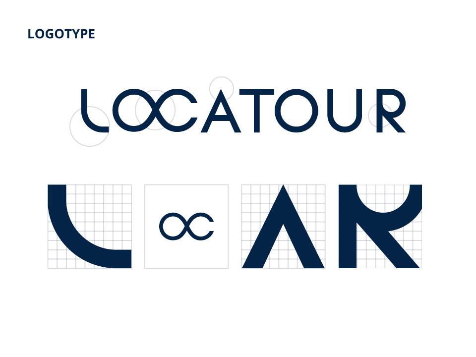
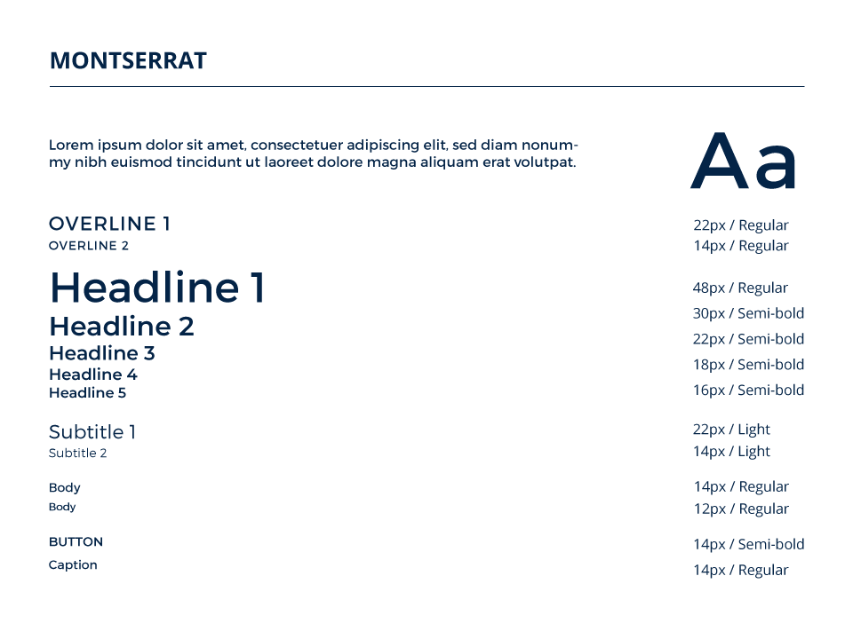
This structural identity is first established through typography. The entire scale relies on Montserrat, chosen for its geometric harmony with the brand logotype. Beyond aesthetics, this typeface provides a clear, accessible hierarchy capable of supporting all levels of content across the platform.
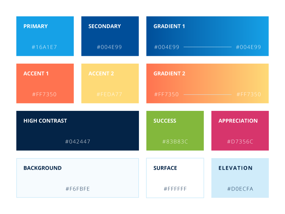
Color completes this foundational layer by translating Locatour’s core travel offerings into a strict, curated palette rather than an endless list of variables. The global palette permanently balances warm yellows and oranges inspired by summer destinations against cool turquoise and deep night blues reflecting winter stays.


Assets
Graphic resources
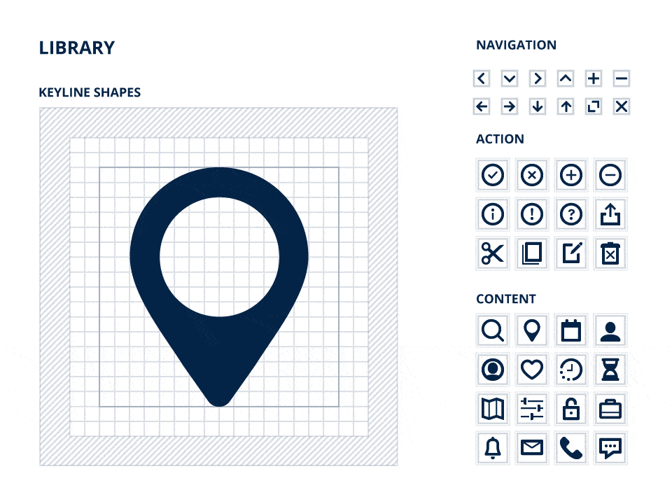
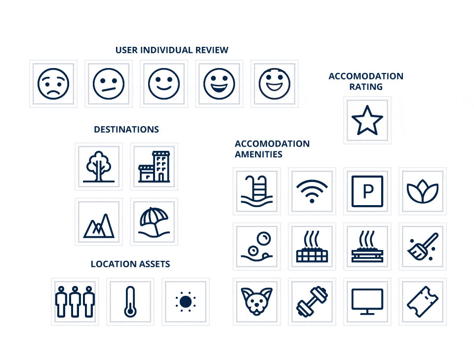
Beyond the foundational tokens, a standardized library of graphic resources was created to guide and inspire the user.
To guarantee optimal legibility and scalable alignment, every icon is systematically constructed on a strict 16px keyline grid. Organized into semantic categories, these icons feature multiple states (outlined, filled, and colored), allowing them to seamlessly transition from simple visual cues to interactive components.
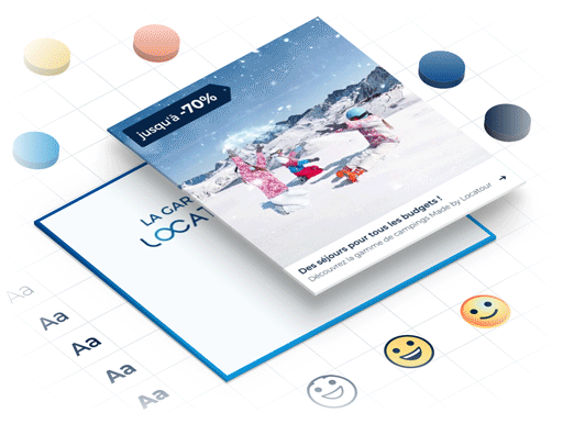
Complementing this technical iconography, a new photographic direction was established, focusing on highly detailed, aspirational imagery. These visuals are carefully curated to immerse future travelers in their potential destinations, conveying the emotional value of the Locatour experience while remaining perfectly integrated into the interface.


Components
Flexible elements
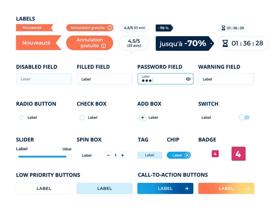
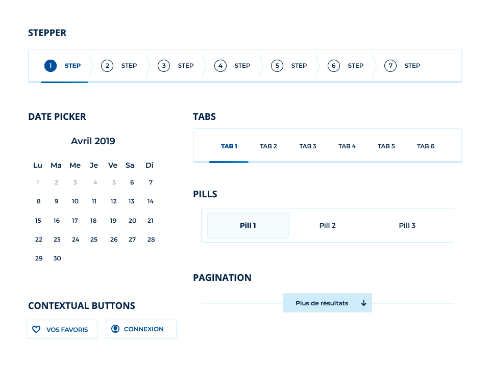
The component library brings the system to life through interaction. Translating foundations and graphic resources into functional UI elements, this layer ensures that every touchpoint behaves predictably across the entire platform.
Moving beyond static design, the focus here lies in comprehensive state management. Every element accounts for a full spectrum of user interactions, including default, hover, active, and disabled states. This rigorous approach guarantees a seamless experience for the user while providing engineering teams with a reliable and ready-to-scale framework.

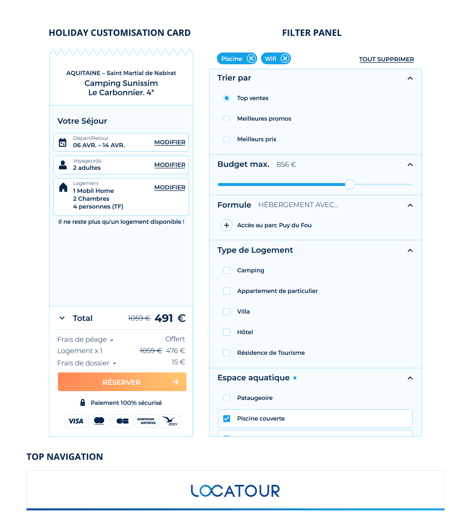
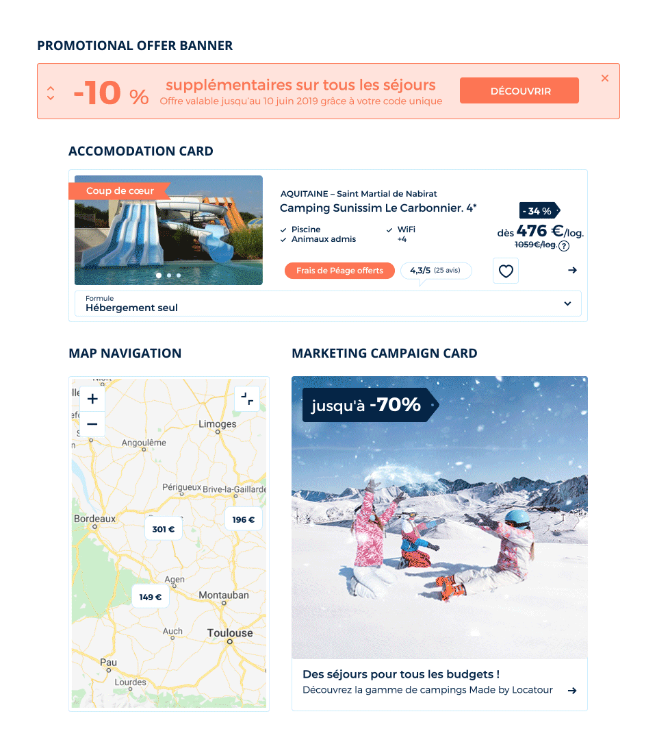
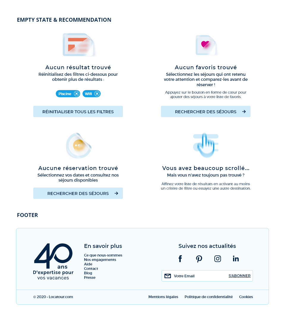
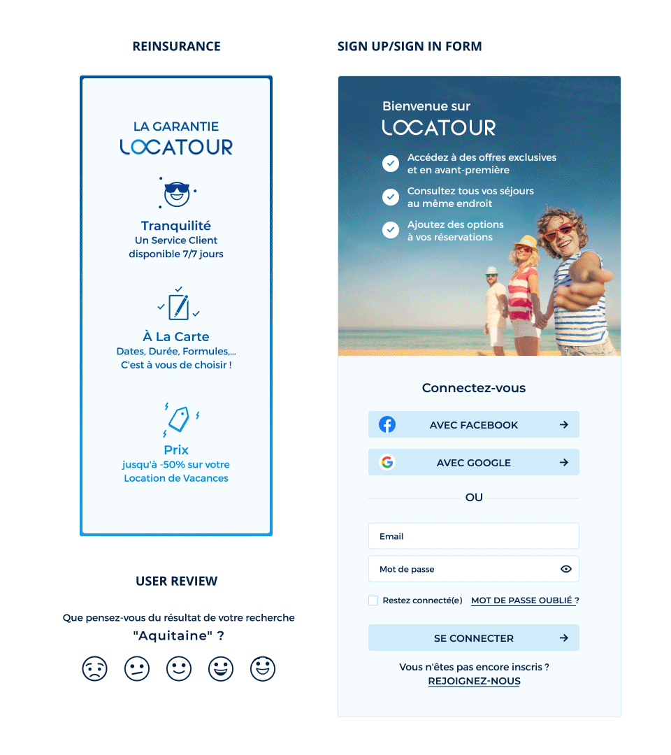
Patterns
Applied solutions
Patterns form the final architectural layer where individual components become complete functional interfaces. By standardizing complex flows, this stage ensures that recurring user needs are met with proven and consistent solutions across the entire platform.
Rather than treating each new feature as an isolated design challenge, these applied solutions establish a shared structural language. Even edge cases and empty states are fully systematized to proactively guide users with contextual recommendations. This overarching consistency drastically reduces cognitive load for the traveler while accelerating the deployment of new features for the product team.
Contact Me