Mobilizing Support for
a Print VentureFrom the smallest cells to the vastness of the universe, science reveals a world of extraordinary complexity. Futura approaches it with rigor, a sense of wonder, and the desire to make science understandable to all.
Supported by a loyal and engaged online community, Futura decided to bring this ambition beyond the web through an ambitious editorial project: a print magazine. To fund this bold venture, the independent media outlet chose to reach out directly to its community by launching three successive crowdfunding campaigns.
It was in this context that I stepped in as a Web and Motion Designer, tasked with bringing this story to life by creating a visual language specific to the campaign and conversion materials capable of transforming readers’ enthusiasm into concrete engagement.
Key Crowdfunding Mechanisms
Convincing an audience to invest in a promise, without any guarantee of success: this is the core challenge of crowdfunding. To transform uncertainty into trust and interest into action, four psychological and visual levers guided the campaign design.
Materializing the product
through photorealistic mockups, giving the audience something concrete to hold on to.

Uniting the community
around a shared goal, made visible through a transparent contribution gauge.

Humanizing the project
by featuring the faces of the team and partners behind the magazine.

Acknowledging the timeframe
by signaling the limited duration of each campaign as a reason to act.
Précampagne > Campagne > Derniers Jours > Prolongations
Campaign-Specific Strategies
Each campaign required adapting to content discovered on the fly, while staying true to Futura’s bold DNA. With each iteration, the creative direction grew sharper, narrowing from a broad product launch to a single editorial question.
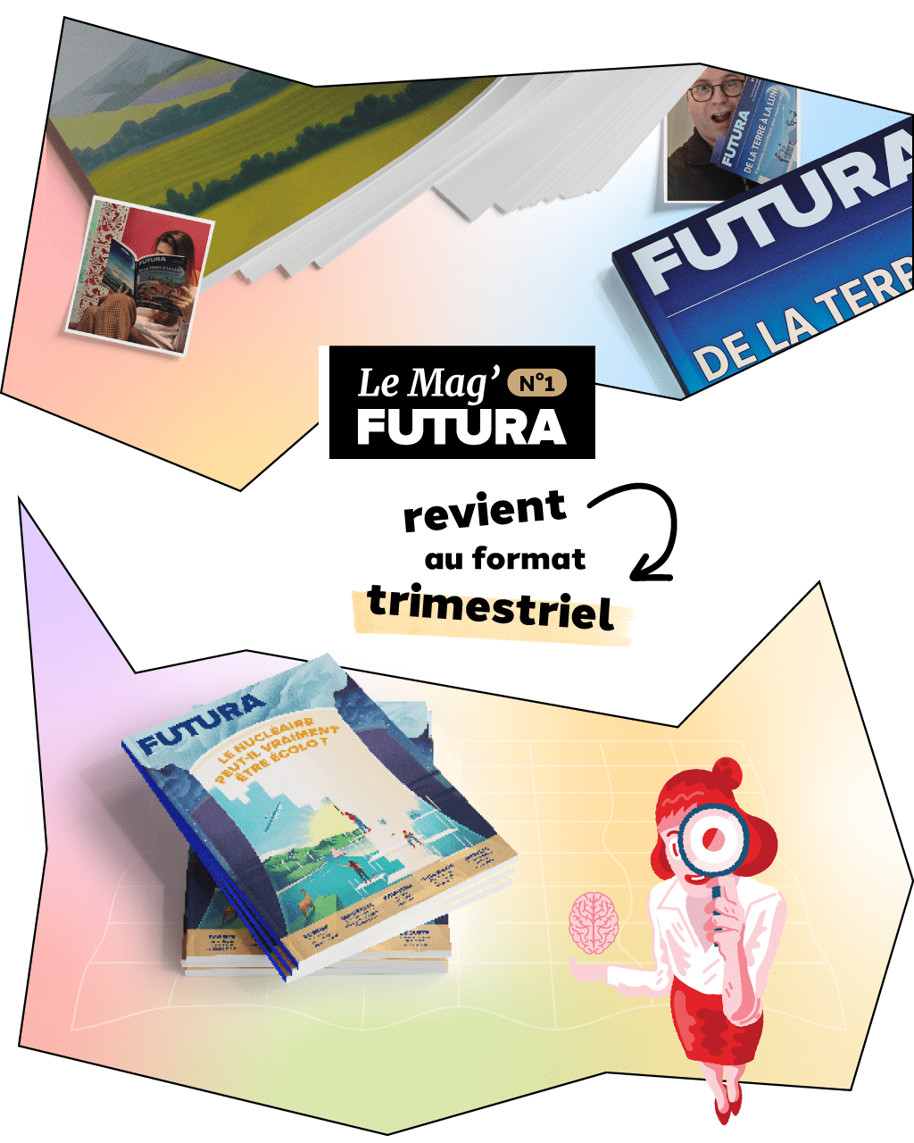
A New Editorial Object
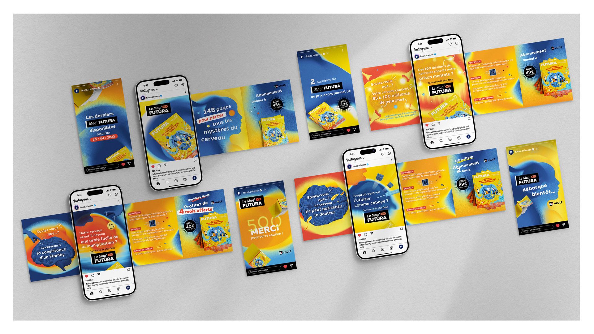
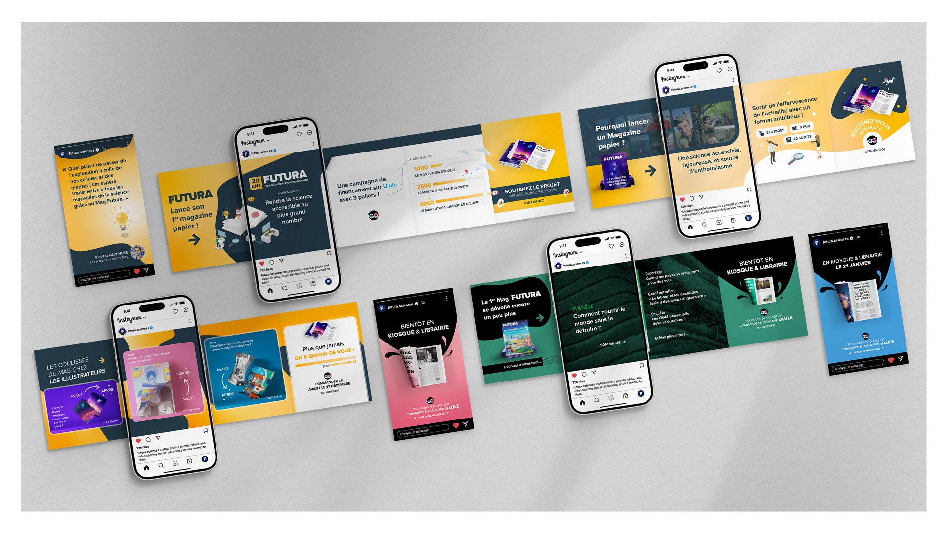
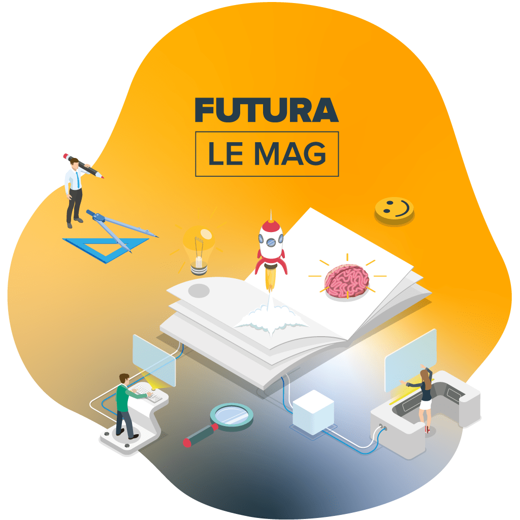
Since illustration is central to Futura’s magazine, it became the natural foundation for the campaign’s visual direction. I chose an isometric style, whose panoramic perspective places the magazine at the heart of each composition, brought to life by small characters representing the teams behind it. Abstract blob shapes, inspired by scientific imagery, completed the visual direction and reinforced the connection with Futura’s universe.
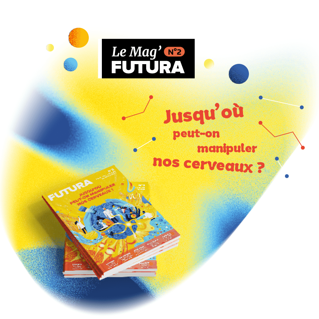
A Single Editorial Theme
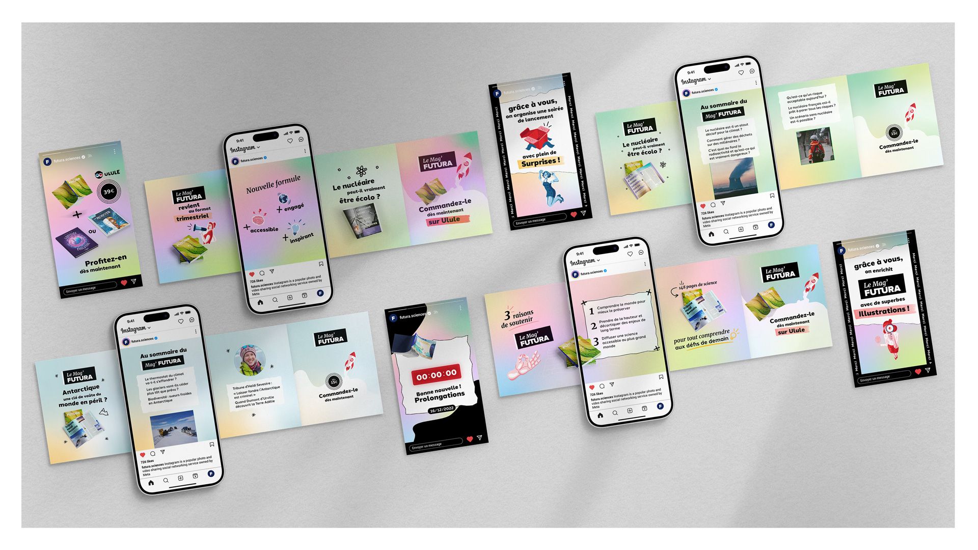
For this second campaign, the visual direction took a more deliberate and human turn. Handwritten shapes, variable font sizes and slight typographic tilts gave each visual a sense of spontaneity, reflecting Futura’s pedagogical approach. The four thematic colors were blended into a holographic mesh gradient, lending the backgrounds a subtle scientific quality. Futura’s own illustrations, with their irregular shapes, reinforced that same organic energy throughout.
A Specific Editorial Question
With the cover already finalized, the campaign could build on a clear visual language from the start. Its yellow, orange and blue palette, along with fluid waves and organic swirls, gave the visuals a vivid and vibrant tone. Subtle paper grain textures and light hatching added warmth while evoking risography, a reference that felt especially relevant for a print magazine. Together, these elements marked the most complete expression of the visual language.
Landing Page Conversion Layout
More than a conversion tool, a crowdfunding page unfolds as a narrative, guiding the reader through the project’s vision, values and substance, section by section:
- The hero section opens the campaign’s story, presenting its core values and inviting the community to rally around a shared cause.
- The product preview, paired with a clear breakdown of backer rewards, gives the reader a concrete sense of what they are contributing to.
- The editorial foreword and table of contents bring the reader into the heart of the magazine, letting the content speak for itself.
- The live contribution gauge acts as built-in social proof, showing how many people have already chosen to support the project.
- A persistent call-to-action ensures that whenever the user is ready to pledge, the decision is frictionless and just a click away.
Social Formats Deployment
Each format had to earn attention in a crowded feed, while guiding the audience toward a single action: backing the landing page. Static visuals carried the core message across Instagram, X, Facebook and LinkedIn with motion content deployed in the final days to drive one last push.